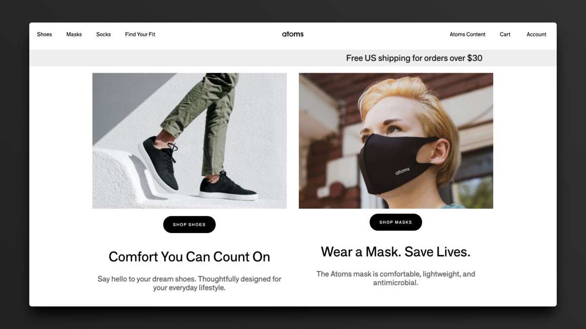
Website:
1 Great Feature:
Great copy that informs and relates all at once.
1 Opportunity:
The colors may be a bit too much here. Needs greater contrast of elements.
Website:
1 Great Feature:
Adds a micro-delight under the button to accentuate the call to action.
1 Opportunity:
Show us the newsletter on a device.
Website:
1 Great Feature:
Gives a demo on page with no effort required.
1 Opportunity:
Could use some empty space at the bottom for social proof.
Website:
1 Great Feature:
A little context goes a long way here. Highly focused.
1 Opportunity:
Change the main CTA from Discover to Sign Up.
Website:
1 Great Feature:
Showcases real people wearing Lambda School swag.
1 Opportunity:
Add social proof below the button (X students have found jobs).
Website:
1 Great Feature:
Contrasting to a tee. White background, black text, red button.
1 Opportunity:
Show how many people use Notion every day.
Website:
1 Great Feature:
Case studies available for real people right above the fold.
1 Opportunity:
Room for improvement on messaging. It isn't 100% clear what On Deck does here.
Website:
1 Great Feature:
Perfect color palette to make dark mode work.
1 Opportunity:
Include social proof of how much has been given to companies through Pipe.
Website:
1 Great Feature:
All content focused to one side for ease of submission.
1 Opportunity:
Point the CTA straight to the app store instead of texting the link.
Website:
1 Great Feature:
Shows exactly what you'll expect to see when you download the app.
1 Opportunity:
Make the phone image a GIF for even greater context.
Website:
1 Great Feature:
Puts the focus on the software and its superpowers.
1 Opportunity:
Test out displaying a product GIF instead of product images.
Website:
1 Great Feature:
Perfect text alignment and awesome positioning.
1 Opportunity:
The product demo is just a tad too far down the page.
Website:
1 Great Feature:
Makes a complex product more accessible with imagery.
1 Opportunity:
Increase the size of Start Now and remove the secondary CTA as a test.
Website:
1 Great Feature:
Clear focus on the sign-up box. Eyes go nowhere else.
1 Opportunity:
No ability to add much social proof.
Website:
1 Great Feature:
Minimal and beautiful, but shows us everything we need to see.
1 Opportunity:
The CTA button is a little too far down the page.
Website:
1 Great Feature:
Displays the newsletter contents prior to sign up.
1 Opportunity:
Eliminate redundancy of the logo in the nav and hero.


